The Fashion and Textiles Museum, located in the vibrant Bermondsey village of the UK, is a hub for contemporary fashion and textile designs. The museum proudly exhibits an impressive collection of textiles designs, including 45 pop art illustrative pieces by the renowned artist, Andy Warhol. With its eye-catching bright pink and orange exterior, the museum perfectly embodies the trendy, fashionable atmosphere of its surroundings. But the museum isn’t just for admiring art; it’s a place where visitors can actively participate in fashion and textile design. The museum offers an array of classes, including fashion designing and pattern cutting, providing a unique opportunity for visitors to hone their skills and explore their creativity.
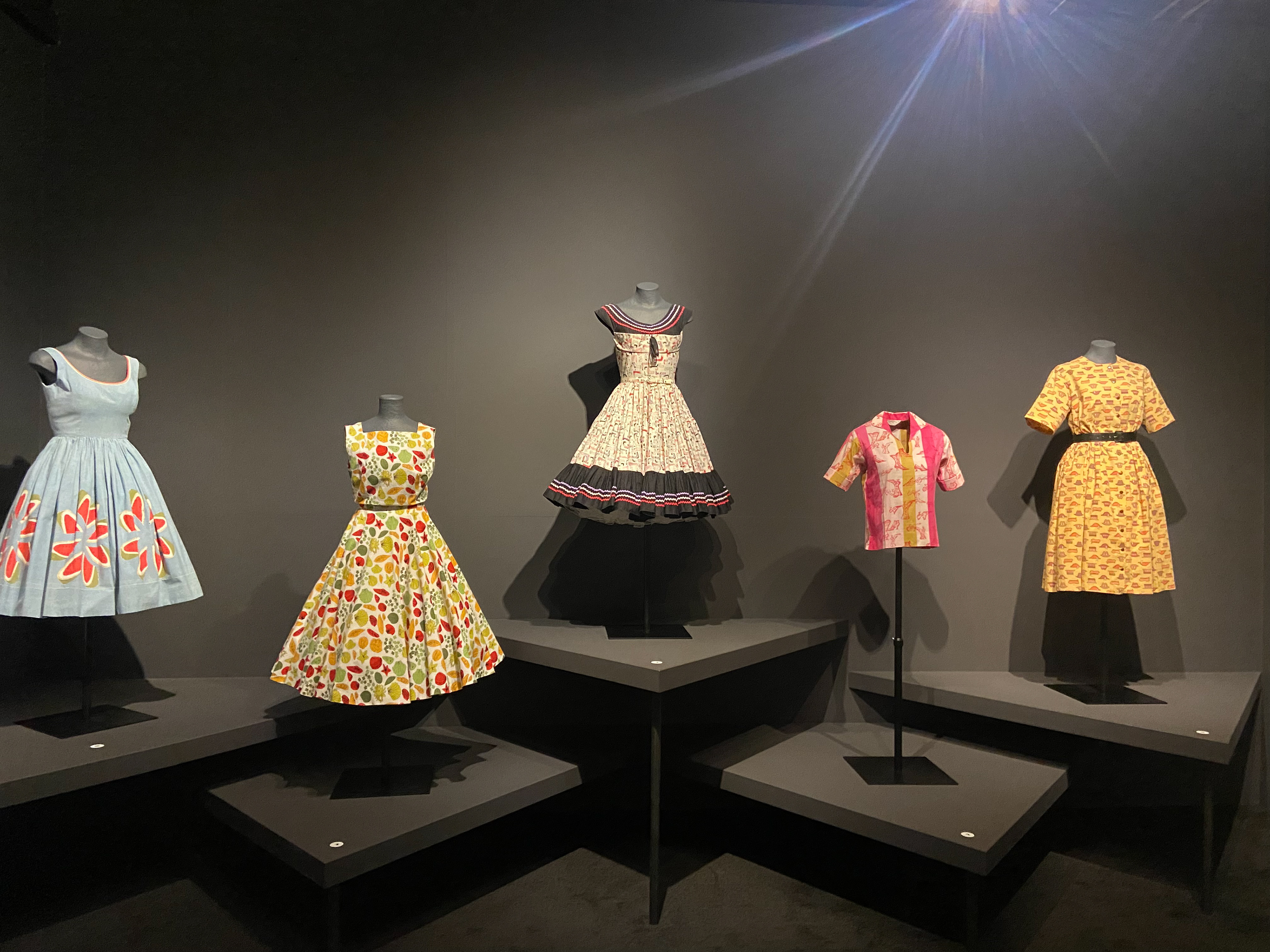
After creating personas for the The Andy Warhol Exhibition at 'The Fashion and Textiles Museum' the problem I identified to develop on is that it is short and not interactive making it boring and difficult to consume information.
Making my goal is to create an engaging atmosphere for the younger generation through the use of digital interactive design.
I will create a Phgital element of the exhibition that allows people to interact with the designs by seeing them selves in the clothes.
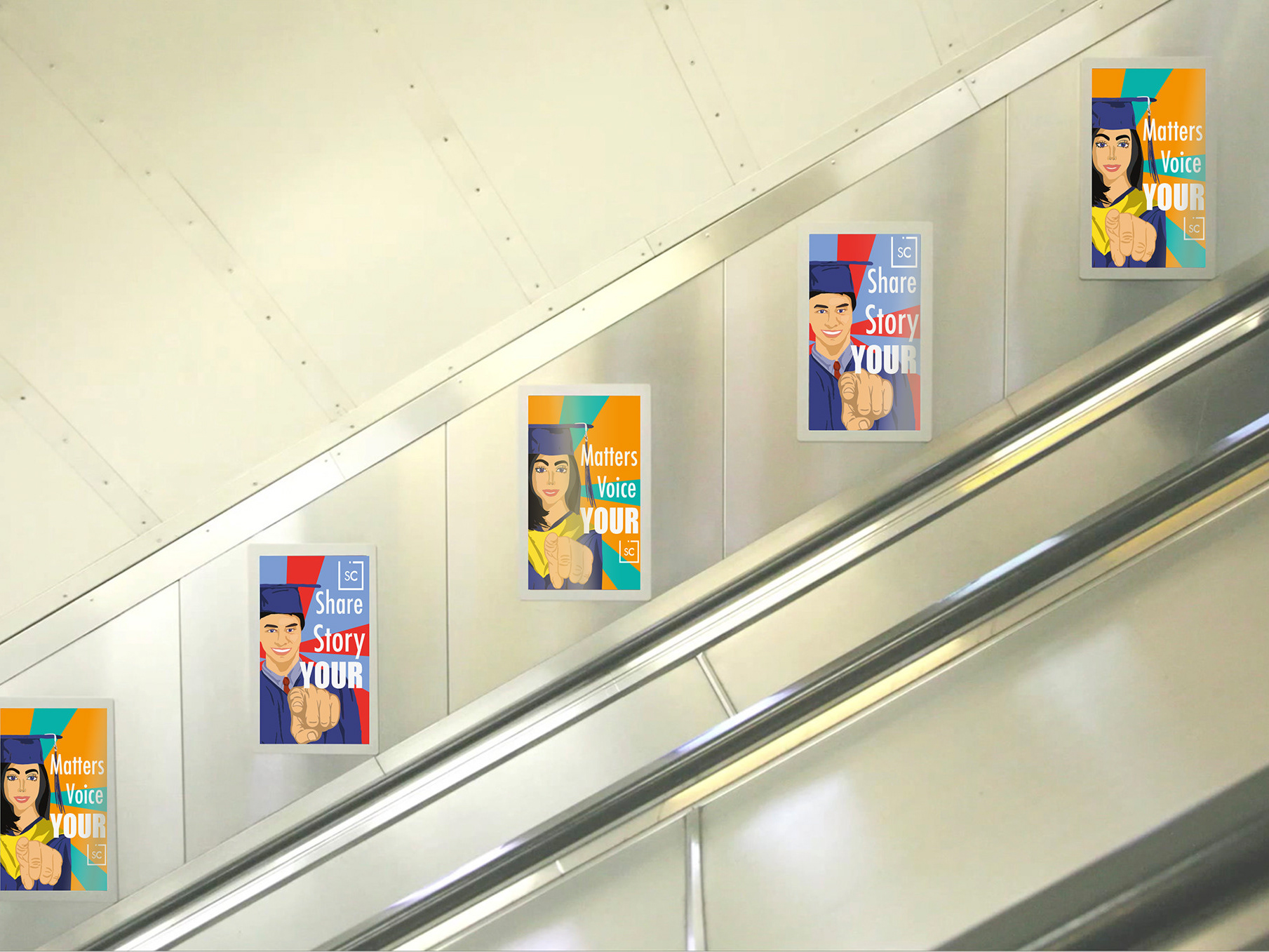
I will design poster and QR codes that allows easy recognition of what, where and how you can scan the clothes.
They will be able to keep these photos as a token of the exhibition and be able to share the images on social media which allows free advertising for the museum.
This idea is inspired by phgital media, by using your iPhone or any digital device to scan the item of clothing so that you can then virtually put yourself into the clothing. After doing so a feature will appear saying because you liked this textile, you might like this, then inspiring the viewer to look around and find the item. Another feature will appear highlight with more information about the item so its engaging and educational
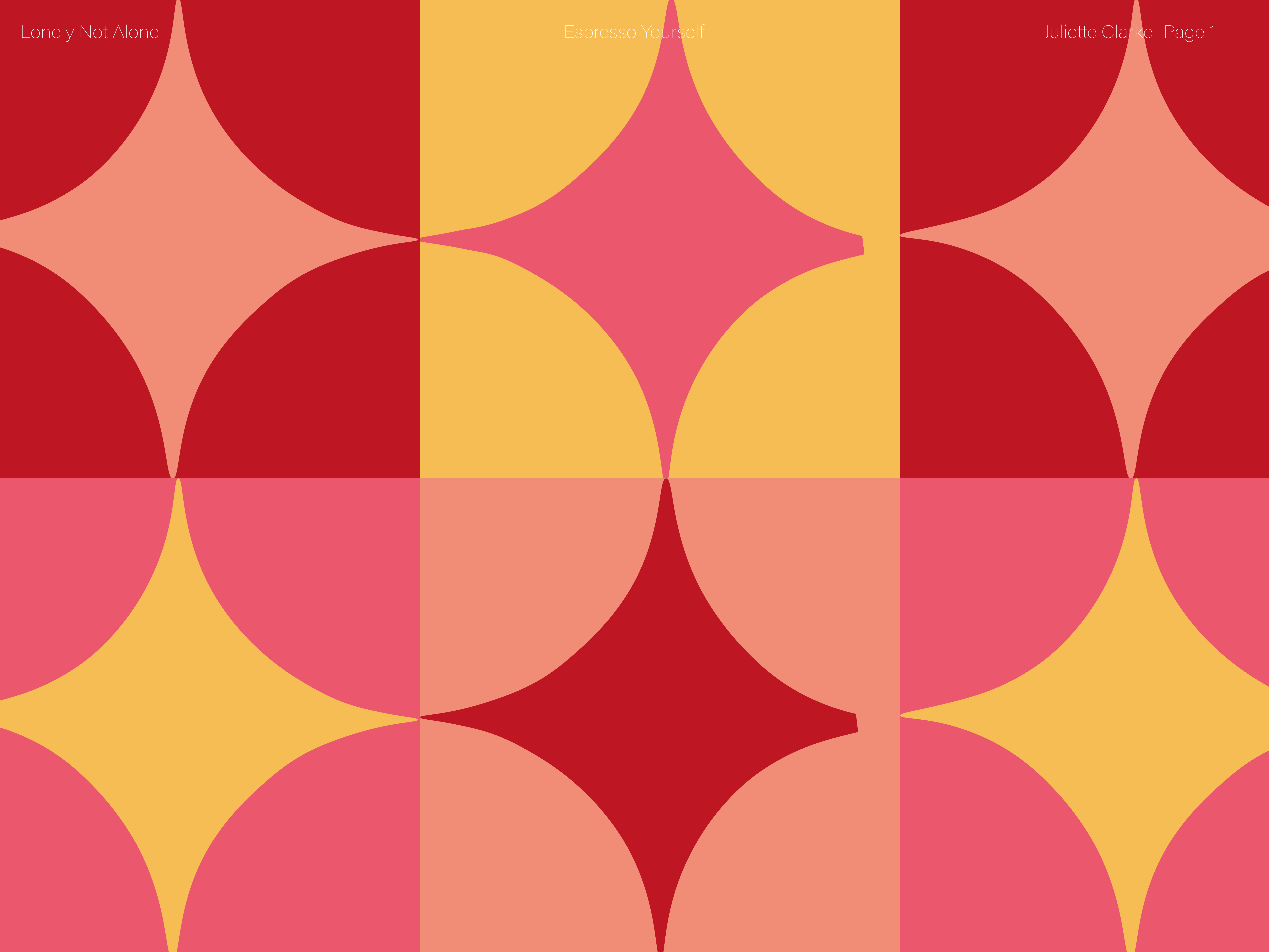
To create a branding identity, I looked into repetitive patterns to keep the idea of the exhibition with the identity. I therefore took inspiration from one of the dresses used in the exhibition to recreate a pattern with. I looked at colours of the museum and other aspects within the museum to use in the patterns such as the pink outline which can be found in the identity of the museum and in the exhibition itself.
This is my final concept for the design and placement. Its at the entrance of the exhibition so you can visibly see it clearly.
These are some of the QR designs, that will be placed around the museum next to textiles clothing that can be scanned. I wanted to make sure that is was clearly understood which clothing could be scanned and to make sure it was visually appealing next to the exhibit.
Once you have scanned the QR code you will be directed to this landing page.
This demonstrates a clear function of how the virtual try on aspect works. There will also be a swipe up feature where it will leave you with information about the item you are wearing
At the bottom of this feature there will be a, 'if you like this find this', this aids the interactive aspect of the museum. It allows the viewer to be apart of the experience and work their way through the museum, taking in the information in a imaginative way.
