This infographic was a small project but I thoroughly enjoyed it as I find layout very visually satisfying to develop. Upon this, the research that was explored for this project title for this project was, technology - hell. It highlights how in todays society there is less privacy than one would originally think, for example your digital foot print and internet programs such as cookies. I looked further into what countries have good and bad internet privacy as well as customer experience or customer opinions.
A digital footprint is the data that you leave online without your knowledge or consent. It can include private messages such as email, browsing history, interests and dislike, your relationship status and even angles that you hold your mobile device Digital footprints are almost permanent, and once they are public, they are almost impossible to get rid of, for example when you post an Instagram picture the owner has little control of who may take it and use that image, it is like a digital reputation. However there are softwares such as VPNs that can encrypt your data on the internet which makes it more difficult to find your internet history.

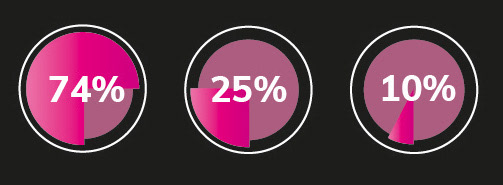
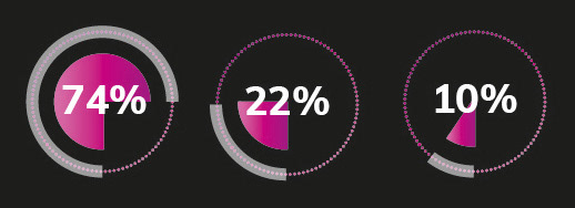
I tested many different variation of designs for recording information to see which style would be most successful and visually appealing. I was aware of the colour designs to be pinks and whites and knew I wanted a circle style to record numerical information. White text on a black background is used in technical advertising campaigns because it provides a high level of contrast and is easier to read, especially when the text is small or appears on a busy background.
White on black can convey a modern, technical, and sophisticated look, which is often desired in technology-related advertising. This type of colour scheme can also emphasise a sense of power and sophistication, which is often desirable for technical products that are marketed to consumers or businesses. White on black colour scheme is aesthetically appealing to some people, making it more visually appealing to a wider audience.
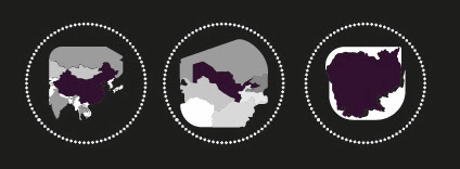

I used a colour variation to report positive and negative information, the information on the right consists of best countries for internet privacy whilst the information on the right is the worst. I though the darker the colour forebodes the hell aspect whilst the lighter colour a heaven.
