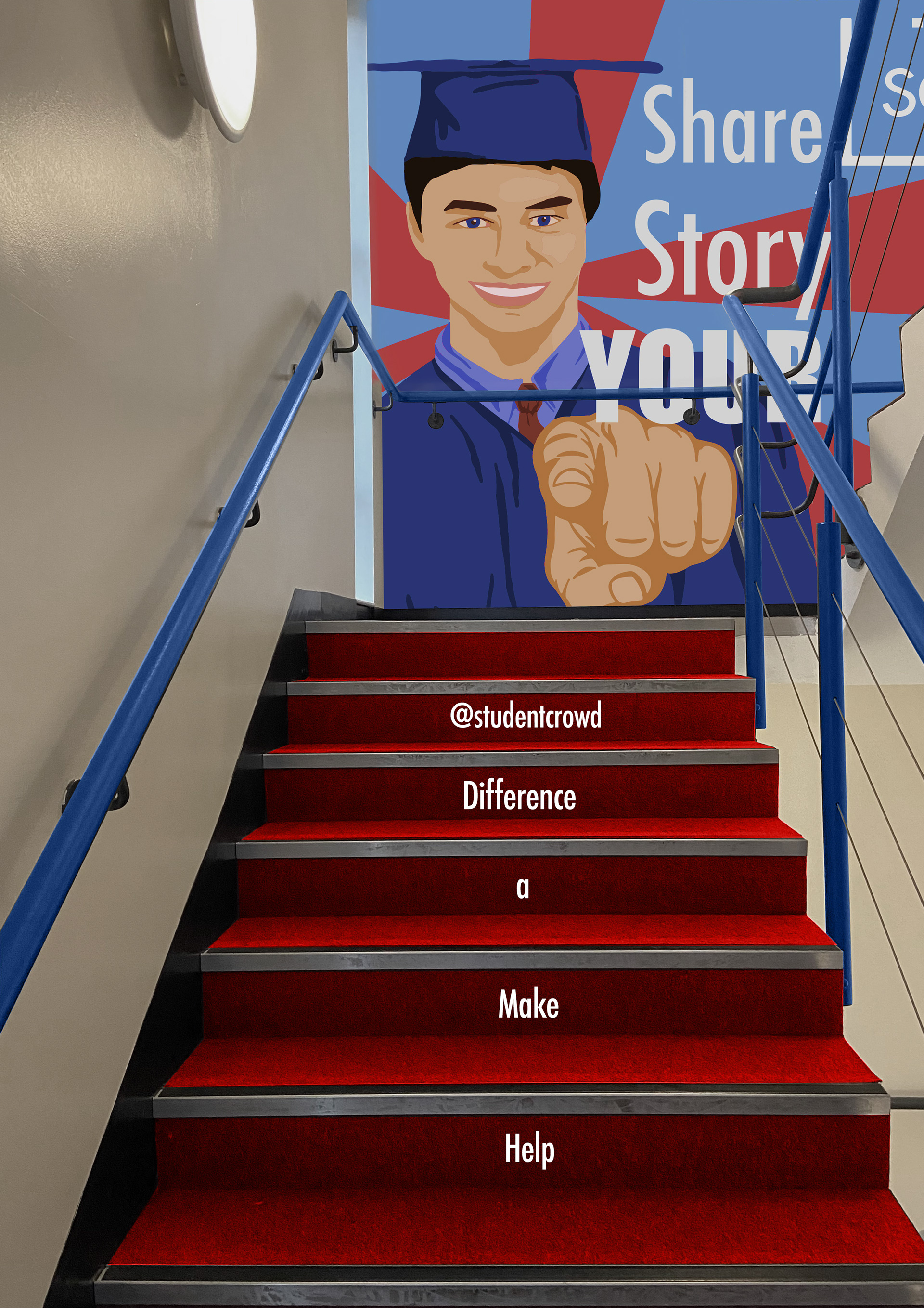
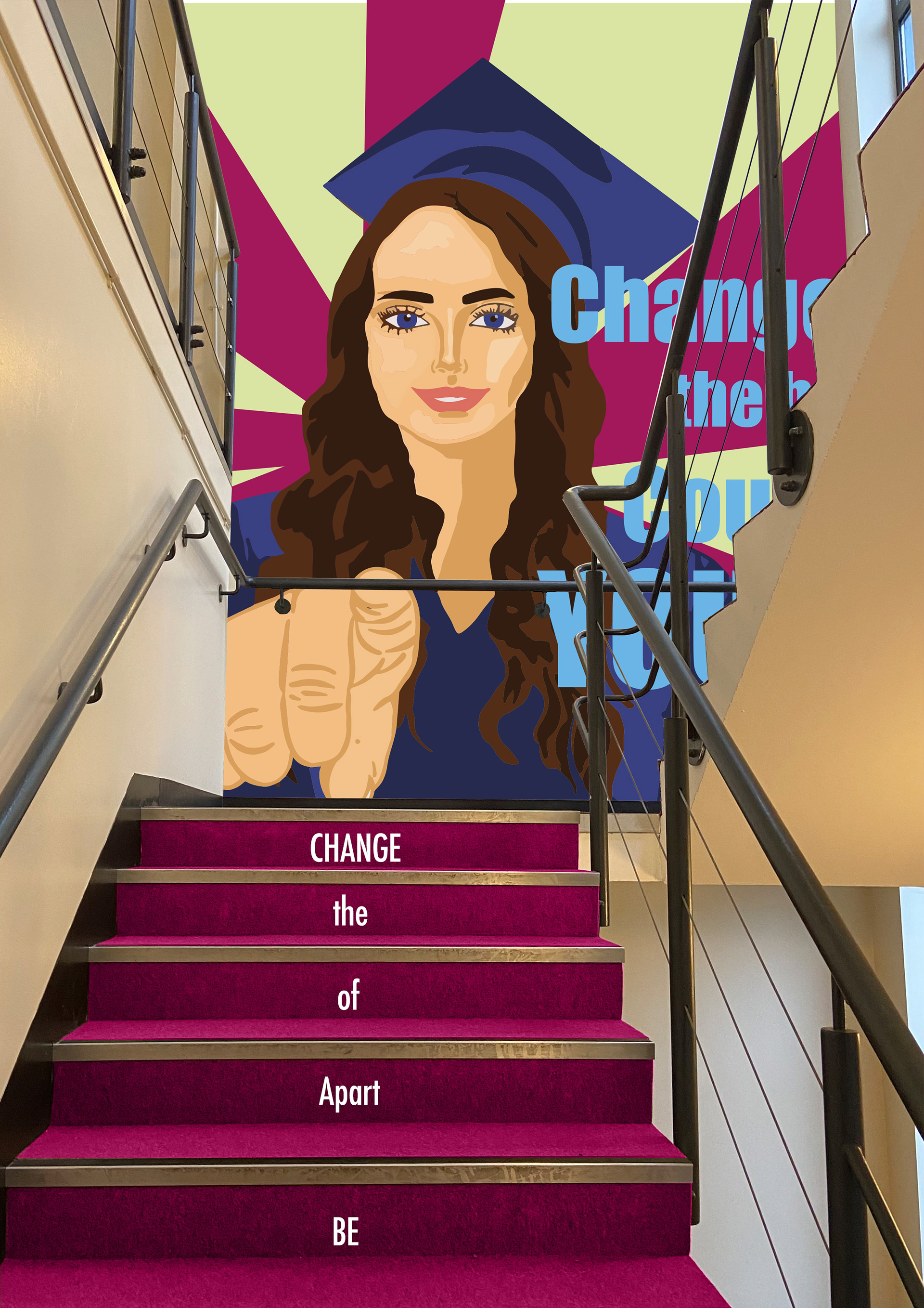
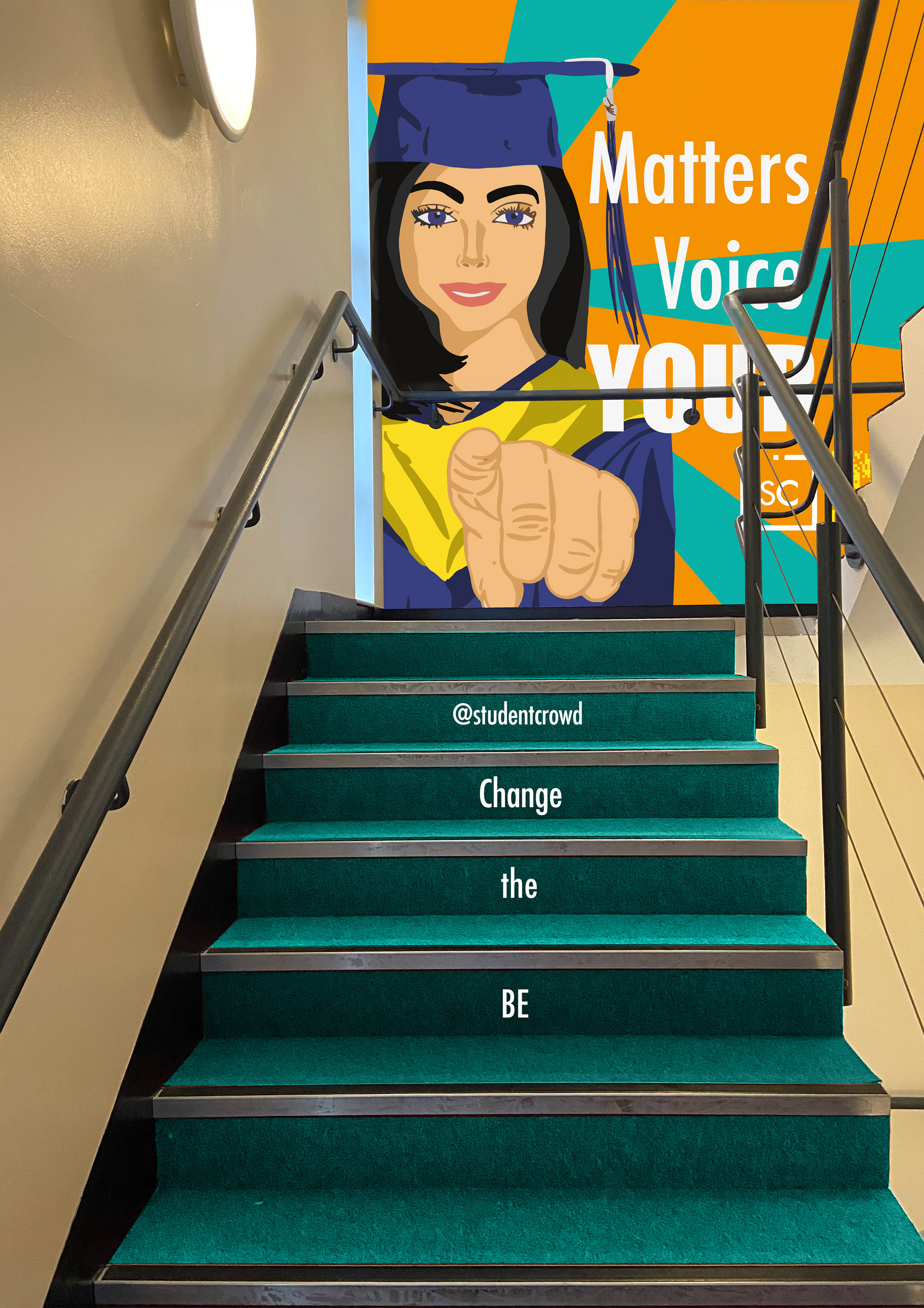
Student crowd review company is a business that utilises a large group of students to provide honest feedback and evaluations on various aspects of uni. My social design project is to aid this company by designing a project to help let more students aware of the company to help student crowd have more access to student to help other student have an insight on universities. The design is an illustrated image of a graduated student. I chose modernised image of the ‘Uncle Sam Your Country Needs You’ because it is a body composition effective piece of work that targets the audience in an emotional way. The focal point of this design is to be placed in university campus areas such as student unions, libraries or student accommodations.
I decided to proceed with three designs to create a visual hierarchy message. The idea is for the image to be placed in stair cases, as you proceed up the stair case you are constantly involved in this we need you message. This repetitive message is in aid to persuade the student to feel a responsibility to help another less informed student.
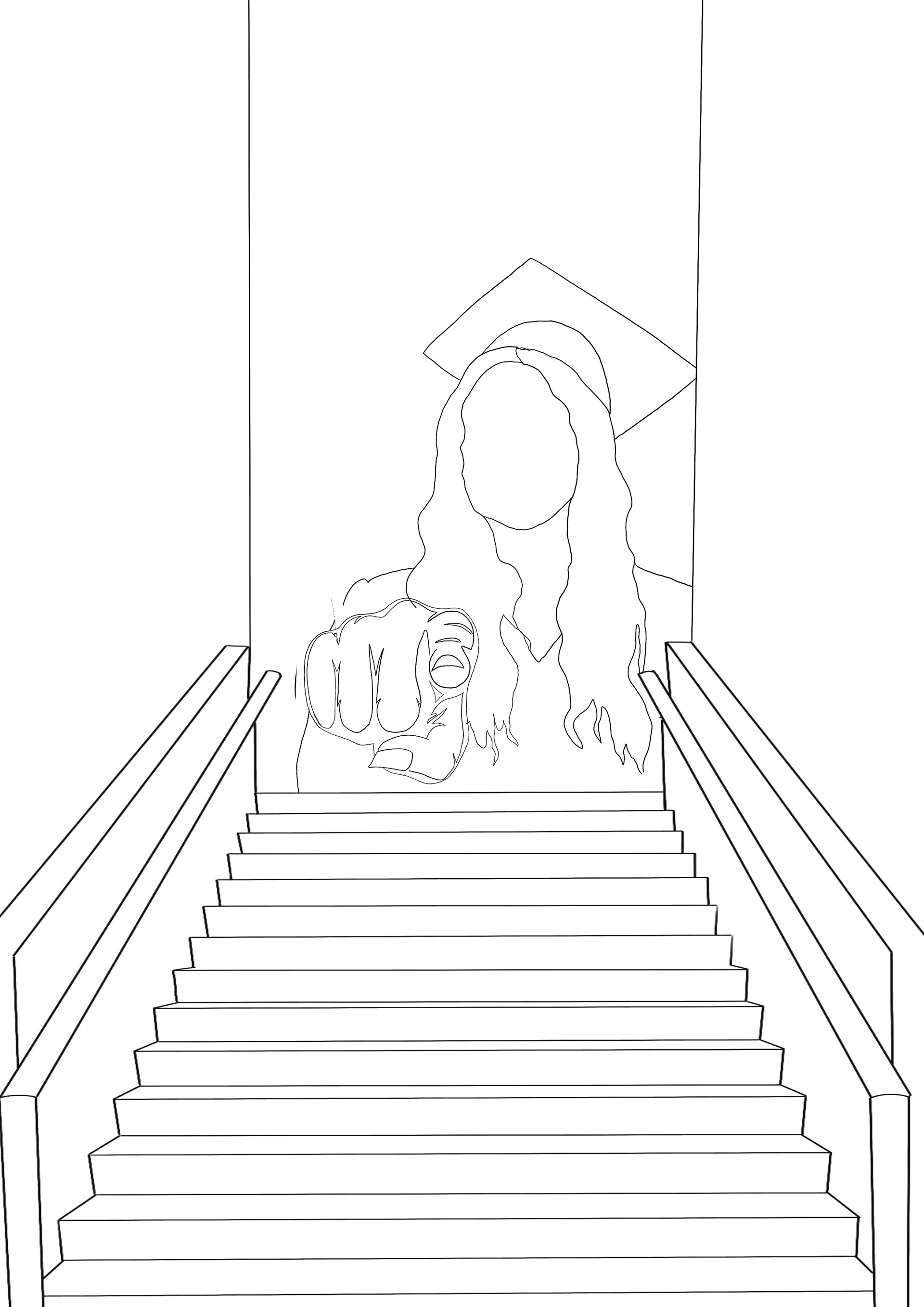
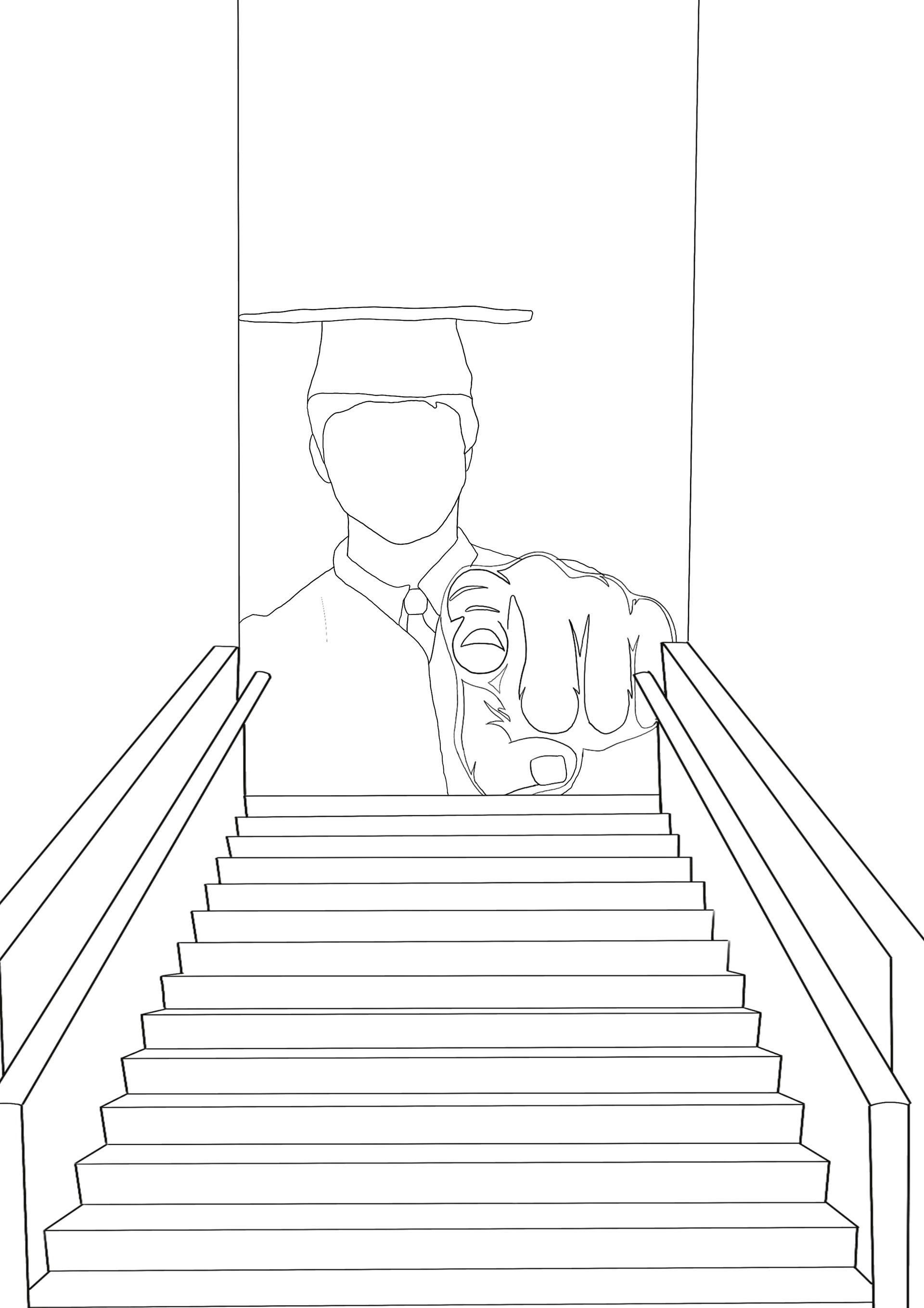
The word “you” in the poster makes it more emotional and relatable because it directly addresses the viewer. Using “you” makes the message more personal and can create a sense of connection between the viewer and action being advertised. It can make the message feel more urgent and relevant, as if the viewer is being directly called upon to take action. Additionally, it makes the student see themselves in the message, it can increase their level of interest and engagement, which can lead to better recall and more effective marketing campaign.Furthermore, the composition of the pointing finger directly at the viewer reiterates the sense of accountability and responsibility. It makes the viewer feel as if they are being personally called upon to take action.


By using both these methods and placing the image of the person as a graduated student makes it more relatable as they can see themselves in that position. It motivates the student to help aid unaware students and give them the information that they perhaps never received. I chose to do three different styles so that there is a wider target audience.The style of the illustrations was inspired by pop art because the colour, which are associated with the student crowd brand, are bright and eye catching. Using an explosion of colour coming from the image of the student in the centre give a focal point
