The Royal Albert Docks Liverpool was a branding and strategy project, understanding how branding is more than just a logo and should be considered a visual system that connects the audience to a place. The research concentrated on the location of Liverpool and recognised its current audience. Upon that information, I created a campaign that raised awareness on an unbranded neighbourhood, The Royal Albert Docks. I created many ideations and development testings to promote the docks through touch points. To start my ideation testing I created three brand values that could relate to the docks and a persona created from research of interviewing the docks community. From this research I established my values as antiquity, community and environmental and began my branding .
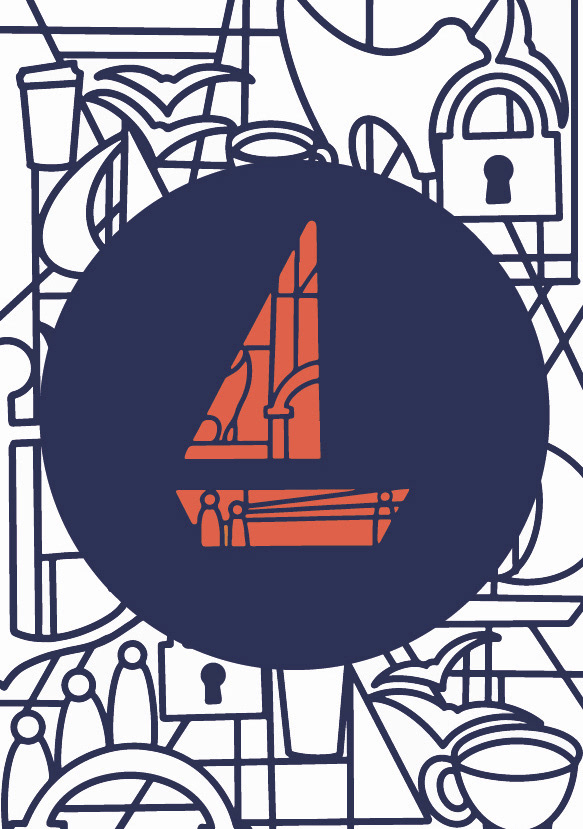
As community is the main value I am refining I drew some icons that reiterate this idea, such as coffee cups, the residents that live there, patterns from residential buildings which are seen as iconic such as the Tate and locks which correlate to the couples pillars.
Despite focusing on the community aspect I thought it was important to established other depictions of symbols that remind the consumer of the docks such as anchors, sails and seagulls.
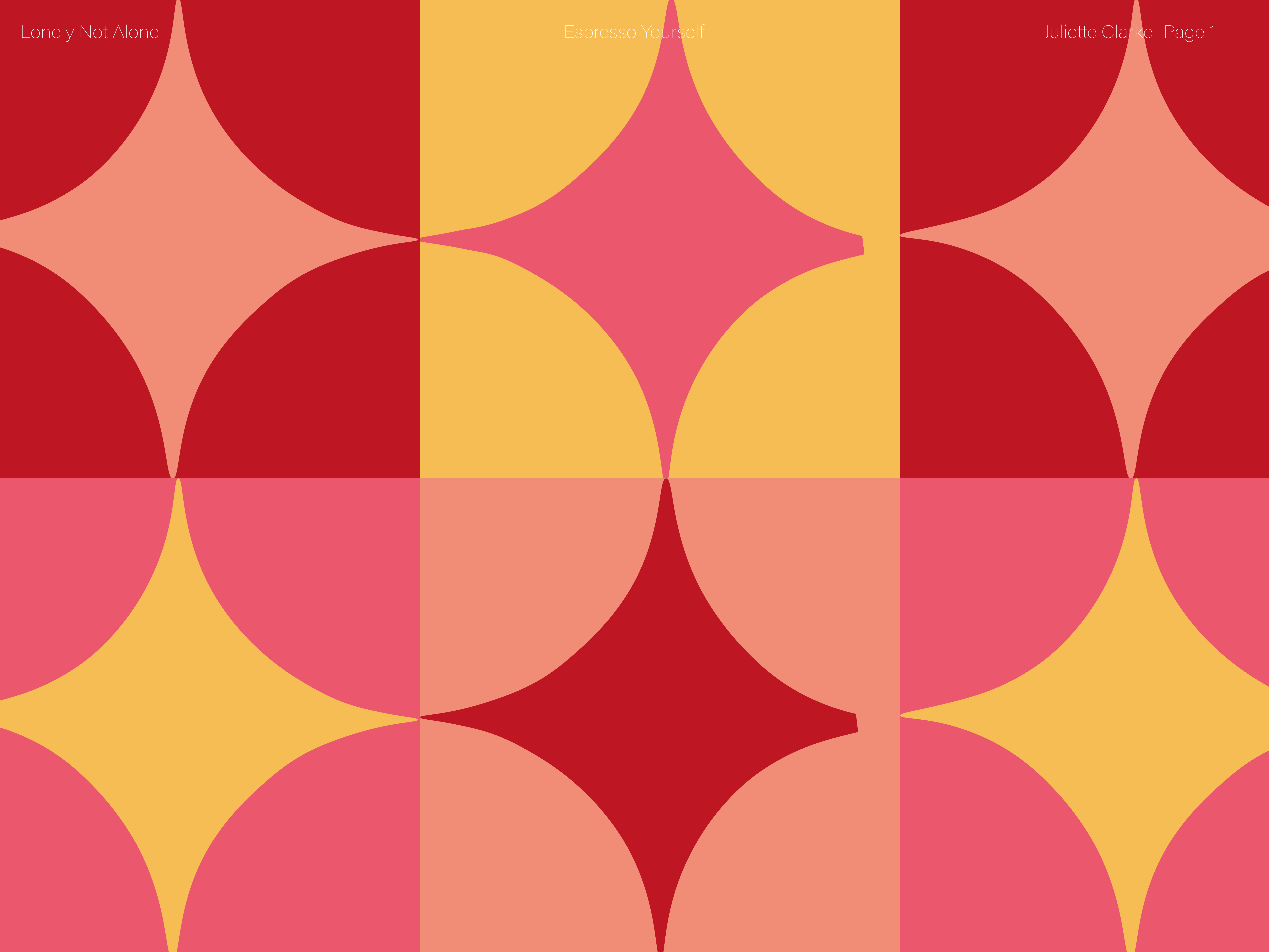
I thought geometric patterns could be interesting approach to advertise the docks because these patterns are often found in nature thus reintroducing the value of environment into the design.
The red is an association with the physical docks whilst it could also promote excitement and urgency. The colour blue is a correlation to the water but could also evoke trust and security in the community. I didn’t want to leave the colours just there, so I added yellows to radiate a cheerful and positive atmosphere whilst the orange tones promotes energy. Involving these colours creates a primary colour scheme which is easy to identify.
This design I was inspired by Porto geometric icons, I wanted to mainly use icons and symbols of things in the location as I feel they can speak for themselves and allow the consumer to interpret the symbols. I chose friendly symbols and colours for the docks to be associated with. Geometric patterns focus on mixing the simplicity of symbols to make beautiful patterns creating a visual interest to the consumer.
I felt that the mural could be quiet overwhelming to the viewer so I simplified the shape to a boat icon. It simplifies the mural into another symbol, using symbols to create an icon. I chose this icon as I think it would be a quick recognition to the water and therefore the Albert Docks. I think by using the boat icon to signify the waterfront is an appropriate icon for the dock due to the history of the docks major involvement in the world trade in the 1800s. The icon pulls the idea of a community in a modern style whilst also retaining the history that brought the docks to where it is today. The icon holds the values of the brands ‘Community’ and ‘Nautical Antiquity’ at the forefront of its advertising


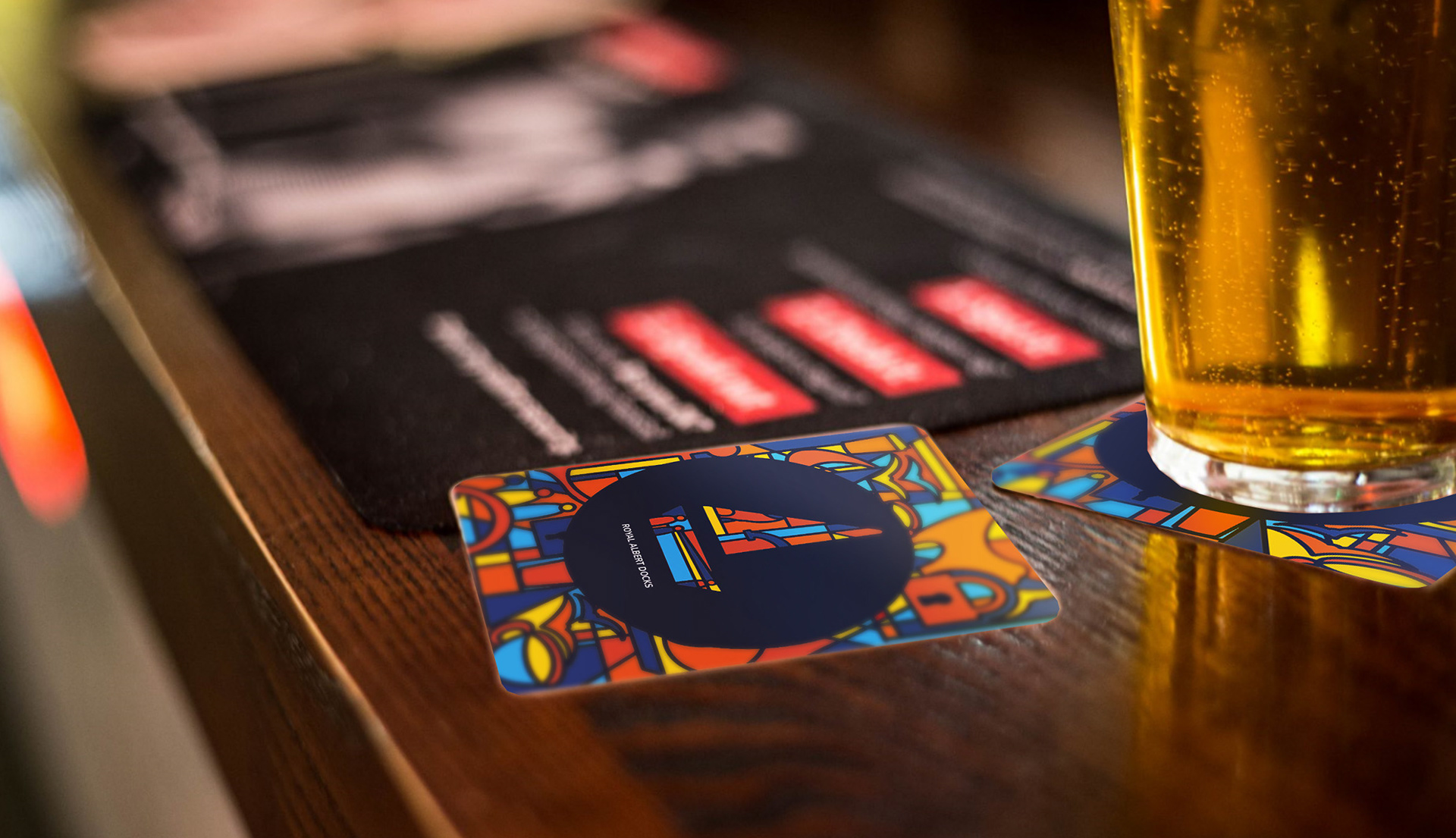
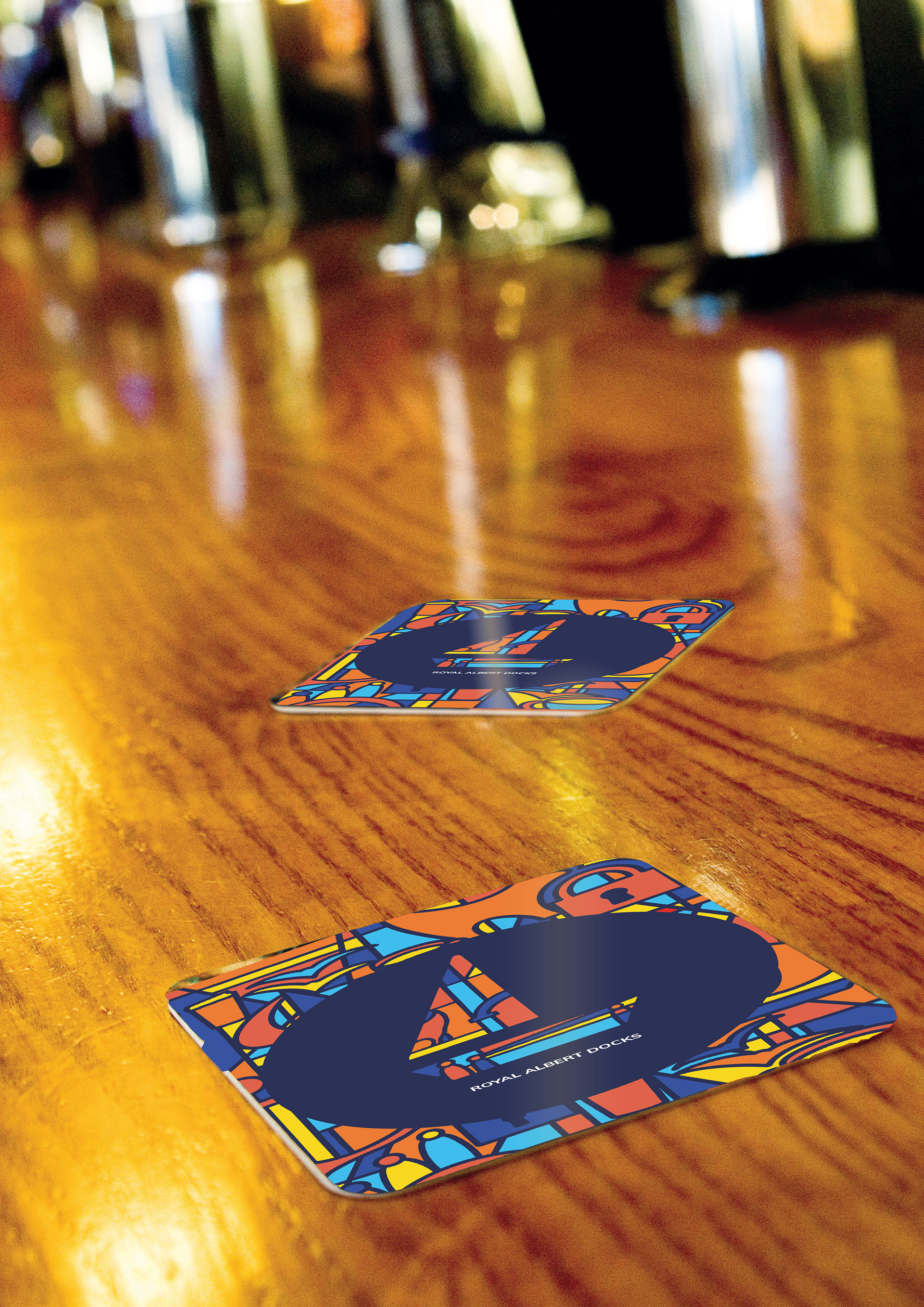
I felt the design of just the boat was quite simple and uninteresting therefore I thought of re enrolling the background but cutting out space to create balance. By creating a circle to put the icon in the centre highlights a sense of importance.
I then tired different colour processes to see which colour formats compliment each other the best whilst still incorporating brand values into the design





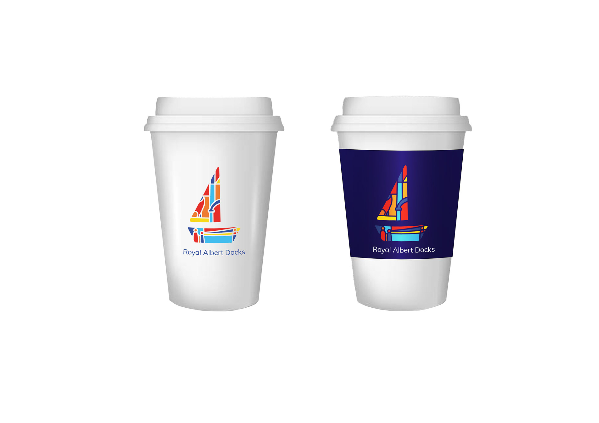
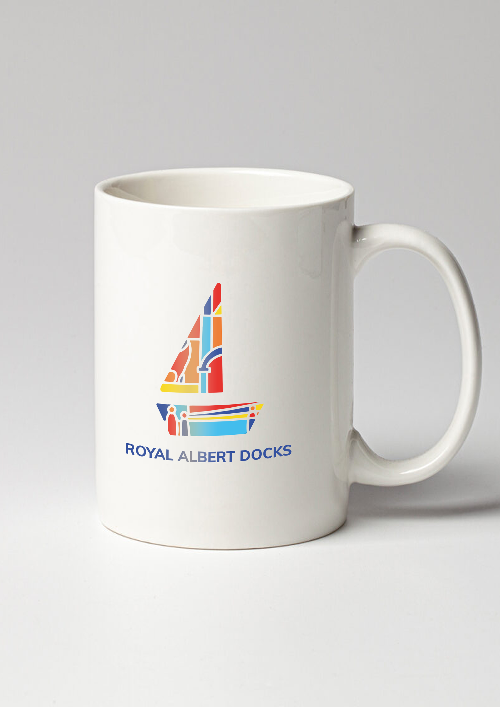
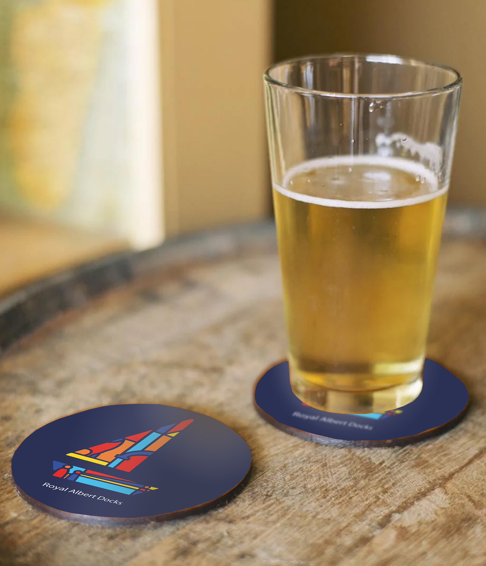
I chose a boat as the forefront of the brand because it is easy and recognisable as well as clear to understand. The boat is an instant recognisable shape, thus associating it with the docks would mean people could remember the shape before they even read the type. It is also easy to reproduce. The style features a minimalist geometric design to highlight that the docks are adapting to a modern culture rather than being associated with its old heritage.
Within the design I included many icons which become a visual structure to represent the docks, viewing each icon individually or as a structure of symbols that express the nurturing nature of the docks. It aids the identity of the docks and helps communicate a clear message of community. I chose a San Serif font to complement the minimalist design. Looking at the aesthetics of the docks I found inspiration of using reds and blues as a main feature due to the docks having red pillars located all around and the blue to associate it with the sea. Furthermore, I added shades of yellow creating s primary colours scheme, strong colours that are easy to identify.
In Context Visuals

Merchandise
